Insights
7 Retail Layout Mistakes That Kill Sales (And How to Fix Them)
May 26, 2026
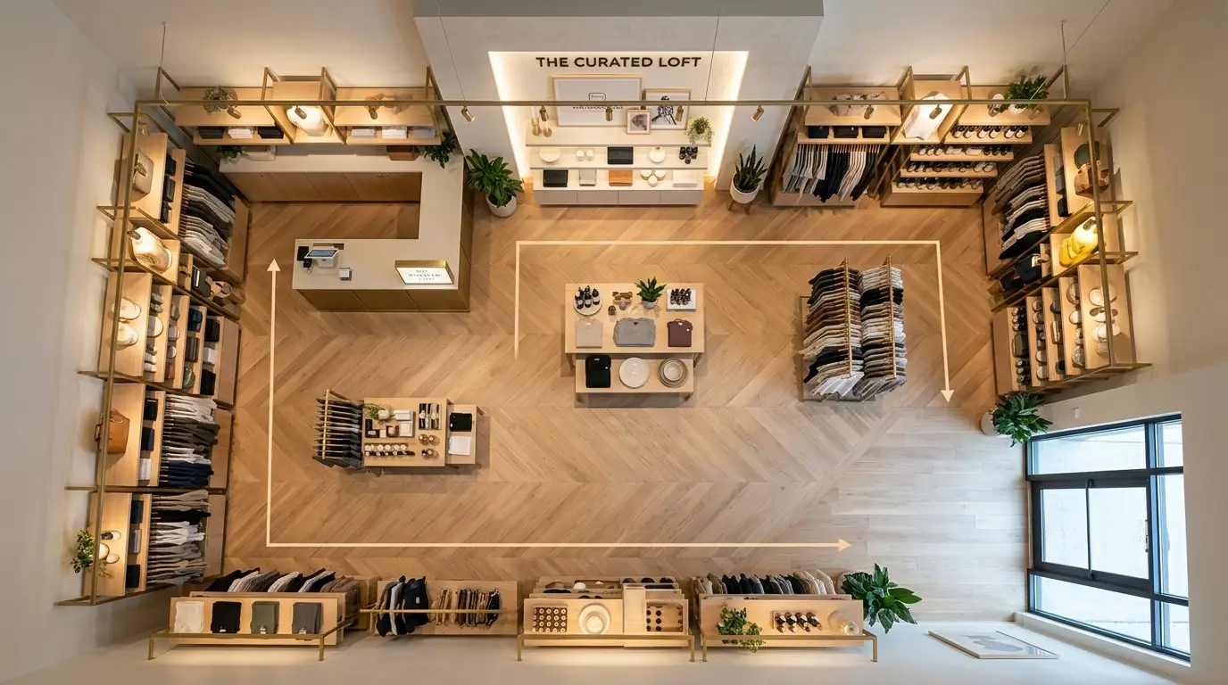
Quick Answer: The seven retail layout mistakes that most consistently hurt sales are: skipping the decompression zone at your entrance, placing fixtures that block sightlines, ignoring the natural right-turn traffic pattern, relying on ambient lighting instead of focused product lighting, loading fixtures with too much or too little product, creating friction between the browsing area and the register, and copying your first store’s layout into a second location without adjustment. Each one suppresses sales in a measurable way. A well-designed retail layout generates 7 to 10 percent more revenue on a sustained basis, and fixing all seven mistakes at once typically produces a 40 percent increase in the first 90 days.
A well-designed retail layout generates 7 to 10 percent more sales than a poorly planned one. That gap is not theory. After working on store environments for Nike and boutique retailers across Texas and Florida, the same seven mistakes appear again and again. They are not exotic problems. They are common, fixable, and costing store owners real money every single day.
This post names each mistake directly, explains what it costs in lost revenue, and shows you how to fix it. Whether you are opening your first boutique, running a wellness studio, or planning a second location, these are the layout principles that separate stores that perform from stores that plateau.
1. No Decompression Zone at the Entry
The first five to eight feet inside your door are dead selling space, by design. Customers who just walked in from a parking lot, a busy sidewalk, or a loud mall corridor need a moment to slow down, adjust their eyes, and shift their mental state before they are ready to engage with product. Retail researchers call this the decompression zone.
Most store owners treat that zone as premium real estate and fill it with their best merchandise or a cluttered promotional display. The result: shoppers walk past all of it without registering any of it. Paco Underhill’s retail behavior research documented this effect across hundreds of store audits. The merchandise in the decompression zone posts some of the lowest sales-per-square-foot numbers in the entire store.
The Fix: Keep your entry zone open. Use low-profile fixtures, a welcome mat, a focal display with one single product, or nothing at all. Let that space do one job: signal that this is a different environment. Start your selling story at foot nine.
2. Sightline-Blocking Fixtures That Make the Store Feel Small
When a customer walks in and cannot see the back wall, they make an unconscious decision about the store’s size and inventory depth. If fixtures are tall enough to block the view from the entrance, the store feels crowded, hard to navigate, and overwhelming. Many customers simply leave rather than figure it out.
We see this most often in boutiques that maximize product capacity at the expense of perception. Cramming more product into the space feels efficient, but it reduces the browse time and average transaction value. In our projects, stores that opened up their sightlines after a redesign consistently reported customers spending more time on the floor.
The Fix: Keep perimeter fixtures at full height (72 to 84 inches is standard) but limit floor fixtures to 48 to 54 inches maximum. The goal is a clear sightline from entry to the back wall. If a customer standing at the door cannot see your hero product or back display, your fixture heights are wrong.
3. Wrong Traffic Flow Direction (U.S. Shoppers Turn Right)
American shoppers turn right when they enter a store. This is not a preference. It is an ingrained behavioral pattern documented in retail anthropology research and replicated across store types. Layouts that direct traffic to the left, or that treat both directions equally, typically find that the left side of their floor gets 20 to 30 percent less foot traffic than the right.
That asymmetry is a direct sales loss. If your highest-margin categories or your most persuasive displays sit on the left wall, they are not getting the exposure they need, regardless of how well-designed they are.
The Fix: Design a counterclockwise loop: customers enter, turn right, travel along the right perimeter, loop around the back, and return along the left side toward the register. This is the standard department-store pattern for a reason. Place your highest-margin or most impulse-friendly product in the first 15 to 20 feet of the right-wall path.
Store Layout: Common Mistakes vs. Done Right
| Layout Element | Common Mistake | Done Right |
|---|---|---|
| Entry Zone | Packed with promo displays | Open, single focal point 5-8 ft in |
| Floor Fixture Height | 60+ inches, blocks sightlines | Max 48-54 inches on floor |
| Traffic Flow | No defined path, both sides equal | Counterclockwise loop, right entry |
| Product Lighting | Even ambient light across the store | Accent lights aimed at key products |
| Register Path | Unclear, customer has to search | Visible from any point in the store |
Source: Prestige 360 Design project data and retail behavior research.
4. Using Ambient Lighting Instead of Product Lighting
Ambient lighting sets the mood. Product lighting sells. Most retail store owners understand this in theory but do not execute it in practice. When the entire ceiling is set to the same light level, nothing in the store stands out. Customers scan the floor and leave without pausing on any single item.
At Nike, we used lighting as a merchandising tool, not an architectural afterthought. Hero products got 3 to 5 times more lumens than the surrounding area. The product literally glowed relative to its context. In our wellness studio and boutique projects at Prestige 360, correcting the lighting layer alone has produced measurable increases in dwell time and units per transaction.

A layout review identifies exactly where lighting and fixture placement are costing the store sales.
The Fix: Layer your lighting: ambient (general ceiling), accent (track or recessed aimed at product), and task (fitting rooms, service counters). Accent lighting should be 3 to 5 times brighter than your ambient baseline at the product surface. Use warm white (2700K to 3000K) for clothing and lifestyle product. Use neutral white (3500K to 4000K) for technology and hardware. Do not use the same bulb type everywhere.
5. Fixtures That Display Product Instead of Selling It
There is a critical difference between a fixture that holds product and a fixture that sells it. Over-merchandised fixtures, where every peg is full, every shelf is double-stacked, create decision paralysis. Research on choice overload consistently shows that presenting fewer options at a single point of purchase increases conversion. Under-merchandised fixtures, where gaps are visible and product looks sparse, signal low inventory and reduce perceived value.
The right balance is intentional. Every fixture should tell a story: a hero product at eye level, supporting options within reach, and negative space that makes the display feel curated rather than crammed. We describe this to clients as “fixtures that sell, not just decorate.” The physical presentation of the product is part of the selling process.
The Fix: For each fixture, define one primary product (hero), two to three supporting options, and a clear call to action (price tag, materials card, or QR code with more information). Fill fixtures to 70 to 80 percent capacity, not 100 percent. Use the 5-3-1 rule for shelf displays: five secondary items, three supporting items, one hero product at eye level. Rotate merchandise every two to three weeks to keep the floor feeling fresh.
+40% sales increase in the first 90 days after a layout redesign. This is the typical result we see when a store corrects all seven layout issues in a single project. The impact is cumulative: each fix compounds the others.
6. No Clear Path to the Register
Friction kills purchases. A customer who has decided to buy something can still abandon the transaction if getting to the register requires effort: searching for the checkout, navigating around fixtures, or waiting in an undefined queue area. Every moment of confusion between the buying decision and the completed purchase is an opportunity to lose the sale.
This problem is especially common in small boutiques where the register is tucked behind product displays or positioned at the back in a way that is not visible from most of the floor. If a customer has to ask where to pay, the layout has already failed.
The Fix: The register should be visible from at least 80 percent of your selling floor. Position it at the natural end of your traffic loop, not in a corner or behind a display wall. Use overhead signage, a distinct counter design, or lighting to draw the eye. Add a 3 to 4 foot impulse zone on both sides of the register for small, high-margin add-ons. The path from floor to register should feel inevitable, not accidental.
7. Copy-Pasting Store 1’s Layout Into Store 2
Opening a second location is a milestone. It is also one of the most reliable ways to make all six previous mistakes simultaneously, at scale. We see this repeatedly: a store owner who figured out what worked in their first location assumes the layout can simply be replicated in the new space. It cannot.
The new space has different square footage, different column placement, a different entry orientation, different ceiling height, and often a different customer demographic. A layout that generated strong results in a 1,200-square-foot Austin boutique may actively suppress sales in a 2,000-square-foot San Antonio location with a different entry angle and two structural columns in the middle of the floor. For second location retail design, every layout must be built from the new space’s unique constraints.
The Fix: Start every new location with a blank floor plan. Bring your brand standards, your fixture inventory, and your learned customer behavior patterns, but do not bring your old grid. Conduct a new space planning exercise from scratch. Measure column placement, entry angle, natural light sources, and HVAC positions before placing a single fixture. What worked in store one is a set of principles, not a template.
What We See Across Prestige 360 Projects
In our projects, the decompression zone and sightline issues almost always appear together. Store owners fill the entry because it feels like wasted space, then add tall fixtures to maximize capacity, which collapses the sightline. These two mistakes compound each other faster than any other combination on this list. When we correct both in a single redesign, the change in customer dwell time is visible within the first week.
Working at Nike, we tested traffic flow configurations across store formats in multiple markets. The right-turn behavioral pattern held consistently regardless of store size or category. In our boutique and wellness studio work at Prestige 360, we apply that same counterclockwise loop principle and position the highest-margin categories in the first quarter of the right-wall path. In our experience, this change alone has shifted the revenue split between floor zones by more than 15 percentage points in certain stores.
We have audited stores where visual merchandising fixtures were clearly the original owner’s best purchase decisions: well-built, well-positioned, commercially appropriate. But they were packed so tightly with product that nothing stood out. In our experience, reducing fixture fill from 100 percent to 75 percent and adding one hero product per fixture bay regularly increases both the number of items touched by customers and the average units per transaction. Less product on display sells more.
The second-location mistake is the one we see owners realize too late. By the time they call us, they have already signed the lease, purchased the same fixture set they used in store one, and started wondering why the new location is underperforming. In our projects, we always begin with a full retail fit-out assessment of the new space before anything is ordered or installed. The cost of that assessment is a fraction of the revenue loss from getting it wrong.
Frequently Asked Questions
What is the most common retail layout mistake?
The most common retail layout mistake is skipping the decompression zone at the store entrance. Customers need 5 to 8 feet after walking through the door to adjust to the new environment before they are ready to engage with product. Merchandise placed in that zone is routinely ignored, which means prime selling space is wasted. The fix is simple: keep the entry open and start your product story at foot nine.
How much does a bad store layout hurt sales?
A poorly planned retail layout can suppress sales by 7 to 10 percent on a sustained basis compared to a well-designed one. Traffic-flow errors alone can eliminate exposure to 20 to 30 percent of your floor. Fixing these issues in a single project typically produces a 40 percent increase in the first 90 days, based on projects we have completed at Prestige 360 Design.
Which direction do shoppers naturally walk in a retail store?
In the United States, shoppers instinctively turn right when they enter a store. This is a well-documented behavioral pattern from retail anthropology research. Retail layouts that direct traffic to the left, or that treat both directions equally, typically find that the left side of their floor gets 20 to 30 percent less foot traffic than the right side. The solution is a counterclockwise traffic loop that works with this natural tendency rather than against it.
Should I use the same layout for my second retail location?
No. Copying a layout from your first store into a second location is one of the most costly mistakes we see. Square footage, column placement, entry orientation, ceiling height, and local customer behavior all differ between locations. A layout that performed well in store one can actively hurt sales in a space with different dimensions or demographics. Every new location needs a fresh space planning exercise built from that specific floor’s constraints.
Key Takeaways
- The decompression zone (first 5-8 feet) is dead selling space. Keep it open.
- Floor fixtures above 48-54 inches block sightlines and make your store feel smaller.
- U.S. shoppers turn right. Design a counterclockwise traffic loop.
- Accent lighting should be 3-5x brighter than ambient at the product surface.
- Fill fixtures to 70-80 percent capacity, not 100 percent. Less product on display sells more.
- The register must be visible from 80 percent of the selling floor.
- Never copy-paste a layout from one location to another. Every space needs its own plan.
Every One of These Mistakes Is Fixable
None of these seven mistakes require a full store rebuild. Some, like adjusting fixture heights or repositioning your hero product, can be addressed in a weekend. Others, like reconfiguring your traffic flow or correcting your lighting layer, take more planning but are well within the scope of a standard retail fit-out project. The key is knowing which mistakes you are making before assuming the problem is something else, like foot traffic volume or product selection.
If your store feels like it should be performing better than it is, the layout is usually the first place to look. The floor plan is not a neutral background. It is an active participant in every transaction that happens, or does not happen, in your store.
Get a Free Retail Layout Review
Tell us about your store: square footage, current challenges, and goals. We will identify the layout issues costing you sales and show you what a redesign would look like.
Request Your Free Layout Review
No commitment. Response within 1 business day.
Hugo Ramirez
Former Nike Retail PM, Founder at Prestige 360 Design
Hugo Ramirez spent years as a Retail Project Manager at Nike, designing and evaluating physical store environments across multiple formats and markets. He founded Prestige 360 Design to bring that same discipline to boutique retailers, wellness studios, and growing brands in Texas and Florida. His focus: space planning and visual merchandising that drives measurable sales results, not just aesthetics.